My Network Analysis Workflow
The Networking Archives project is using tools from other disciplines to write histories of seventeenth-century intelligencing and correspondence. Key in the toolset for the project is network analysis. Network analysis is a suite of tools developed to understand and analyse networks, specifically, network graphs, a formal term for a mathematical graph of entities, known as nodes, connected by vertices, or edges. Mostly they boil down to either specific software packages with a GUI, such as Gephi or Palladio, or dedicated libraries within a coding language such as Python’s NetworkX or R’s Igraph.
Using existing software is a great way to get started, but doing network analysis with a programming language is much more flexible, and, I would argue, a better investment of time because you’ll inevitably learn transferable coding skills along the way. There are tonnes of free tools available for converting data into a network format. This blog post is an outline of my network analysis workflow using R. It’s meant for anyone who either uses or intends to use the programming language R and the suite of tools called the tidyverse for data science and would like to know what is (in my opinion) the easiest and most portable method for analysing networks. It’s not a full tutorial: there are lots out there already (Jesse Sadler’s tutorial is excellent)
One of the easiest data formats to construct a network is an edge list: a simple dataframe with two columns, representing the connections between two nodes, one per row. It makes particular sense with correspondence data, which is often stored as a table of letters with a ‘from’ and a ‘to’—more or less a ready-made edge list. In a correspondence dataset you might also have multiple sets of each of the edges (multiple letters between the same pair of individuals). You can add this to the edge list as an attribute called weight, which is simply another column.
I use three R network libraries to do almost everything network-related, from analysis to visualisation: igraph, tidygraph and ggraph. My goal is to port everything to a format which is really easy to work with using existing my data analysis workflow. That format is known as ‘tidy data’, and it is a way of working with data which is easily transferable across a range of uses. It also means you need to learn very little new programming to do network analysis if you stay within this ‘ecosystem’.
Import Network Data with the Tidyverse
The whole workflow uses four packages. The first is tidyverse, a collection of various packages used for data wrangling and analytics.
library(tidyverse)
Next I need some network data. On the project this is generally a comma separated values file containing the information for one letter per row. We turn the raw letter data into an edge list in a standardised format, with the from/to information, a letter date, a place, and a unique identifier for the letter. Because the dataset is large and the same names are often used repeatedly, we use a unique ID number rather than people or place names when constructing the edge list. The nice thing about working within the tidyverse is that it’s easy to then match the IDs back to actual names afterwards.
These edge lists can be turned into a network object using tidygraph and the function as_tbl_graph. This function takes the first two columns in a dataset and turns them into the network graph, using any additional columns as attributes. We use two separate tables of data. First, an edge list, using unique, unambiguous numeric IDs for people and place names. Next, additional lookup tables, just with the unique ID, the person’s name, and additional information, if you have it (which can be used to filter the network afterwards).
First load the two tables into R (I’ve created small sample tables to work with), which are available here and here:
letters = read_csv("/Users/yannryanpersonal/Documents/blog_posts/2021-04-15-my-network-analysis-workflow/letters.csv", col_types = cols(.default = "c"))
people = read_csv("/Users/yannryanpersonal/Documents/blog_posts/2021-04-15-my-network-analysis-workflow/people.csv", col_types = cols(.default = "c"))
If you have multiple letters between individuals, you can sum them and use as a weight in the network, or you can ignore it. You can do this with tidyverse commands: group_by() and tally(), changing the name of the new column to ‘weight’.
edge_list = letters %>%
  group_by(from, to) %>%
  tally(name = 'weight')
Turn the edge list into a tbl_graph
Next transform the edge list into a network object called a tbl_graph, using tidygraph. A tbl_graph is a graph object which can be manipulated using tidyverse grammar. This means you can create a network and then use a range of standard data analysis functions on it as needed, without learning a whole new set of commands.
First, load the tidygraph library. Use as_tbl_graph() to turn the edge list into a network. The first two columns will be taken as the from and to data, and any additional columns added as attributes. It’ll automatically create a nodes table, too.
library(tidygraph)

sample_tbl_graph = edge_list %>%
  as_tbl_graph()

sample_tbl_graph
## # A tbl_graph: 875 nodes and 856 edges
## #
## # A directed simple graph with 114 components
## #
## # Node Data: 875 x 1 (active)
##   name
##   <chr>
## 1 10010
## 2 10177
## 3 10238
## 4 10418
## 5 10506
## 6 1051
## # … with 869 more rows
## #
## # Edge Data: 856 x 3
##    from    to weight
##   <int> <int>  <int>
## 1     1   610      1
## 2     2   611      1
## 3     3   262      3
## # … with 853 more rows
The tbl_graph is an object with two tables, one for the edges and one for the nodes. You can access each of the tables using the function activate(nodes) or activate(edges). The active table has (active) after it.
sample_tbl_graph = sample_tbl_graph %>%
  activate(edges)

sample_tbl_graph
## # A tbl_graph: 875 nodes and 856 edges
## #
## # A directed simple graph with 114 components
## #
## # Edge Data: 856 x 3 (active)
##    from    to weight
##   <int> <int>  <int>
## 1     1   610      1
## 2     2   611      1
## 3     3   262      3
## 4     3   461      1
## 5     4   612      1
## 6     5   613      1
## # … with 850 more rows
## #
## # Node Data: 875 x 1
##   name
##   <chr>
## 1 10010
## 2 10177
## 3 10238
## # … with 872 more rows
Tidygraph allows you to perform calculations on the tbl_graph using mutate, using standard igraph algorithms. So for example to calculate the degree of every node:
sample_tbl_graph %>%
  activate(nodes) %>%
  mutate(degree = centrality_degree(mode = 'total'))
## # A tbl_graph: 875 nodes and 856 edges
## #
## # A directed simple graph with 114 components
## #
## # Node Data: 875 x 2 (active)
##   name  degree
##   <chr>  <dbl>
## 1 10010      1
## 2 10177      1
## 3 10238      2
## 4 10418      1
## 5 10506      1
## 6 1051       1
## # … with 869 more rows
## #
## # Edge Data: 856 x 3
##    from    to weight
##   <int> <int>  <int>
## 1     1   610      1
## 2     2   611      1
## 3     3   262      3
## # … with 853 more rows
If you run standard functions meant to be used on a dataframe, they will happen to the active table. So if you wanted to filter just edges from ID 1, for example, you could use the filter verb from dplyr:
sample_tbl_graph %>% filter(from ==1)
## # A tbl_graph: 875 nodes and 1 edges
## #
## # A rooted forest with 874 trees
## #
## # Edge Data: 1 x 3 (active)
##    from    to weight
##   <int> <int>  <int>
## 1     1   610      1
## #
## # Node Data: 875 x 1
##   name
##   <chr>
## 1 10010
## 2 10177
## 3 10238
## # … with 872 more rows
You’ll notice that the tbl_graph nodes are just numerical IDs - the people information was stored in a different table. We can use left_join() from dplyr to join the lookup table of people to the network object as a last step (this is useful if you have a large network and want to filter it or do some other manipulation first). The nodes table has a column called ‘name’, which contains the original person IDs as found in the letter table and also used in the people table. Make sure to activate the nodes first:
sample_tbl_graph %>%
  activate(nodes) %>%
  left_join(people, by = c('name' = 'id'))
## # A tbl_graph: 875 nodes and 856 edges
## #
## # A directed simple graph with 114 components
## #
## # Node Data: 875 x 2 (active)
##   name  person_name
##   <chr> <chr>
## 1 10010 Committee of both Houses
## 2 10177 Commoners in the east and west fens
## 3 10238 Comr. Peter Pett
## 4 10418 Consul John Milner
## 5 10506 Cornelius Parmot
## 6 1051  Amerigo Salvetti
## # … with 869 more rows
## #
## # Edge Data: 856 x 3
##    from    to weight
##   <int> <int>  <int>
## 1     1   610      1
## 2     2   611      1
## 3     3   262      3
## # … with 853 more rows
Maybe you only want to keep nodes with the title ‘Sir’? Activate the nodes again with activate(nodes), join the people table, then use filter and str_detect to filter based on a regular expressions pattern. You’ll see that it has filtered out unused edges now, too:
sample_tbl_graph %>%
  activate(nodes)%>%
  left_join(people, by = c('name' = 'id')) %>%
  filter(str_detect(person_name, "(?i)sir"))
## # A tbl_graph: 146 nodes and 58 edges
## #
## # A rooted forest with 88 trees
## #
## # Node Data: 146 x 2 (active)
##   name  person_name
##   <chr> <chr>
## 1 40783 Sir Allan Broderick
## 2 40854 Sir Art. Hesilrigg
## 3 40860 Sir Arthur Capell
## 4 40862 Sir Arthur Chichester
## 5 40871 Sir Arthur Hazelrigg
## 6 40875 Sir Arthur Hopton
## # … with 140 more rows
## #
## # Edge Data: 58 x 3
##    from    to weight
##   <int> <int>  <int>
## 1     1    68      1
## 2     2     5      1
## 3     3   100      1
## # … with 55 more rows
Slightly more useful might be to filter based on some calculation you’ve made previously. The data format allows you to use dplyr pipes (%>%) to perform one calculation on the data, then pass that new dataframe along to the next function. It works really well with tidygraph. Here we calculate the degree scores first, then filter to include only nodes with a degree score over two:
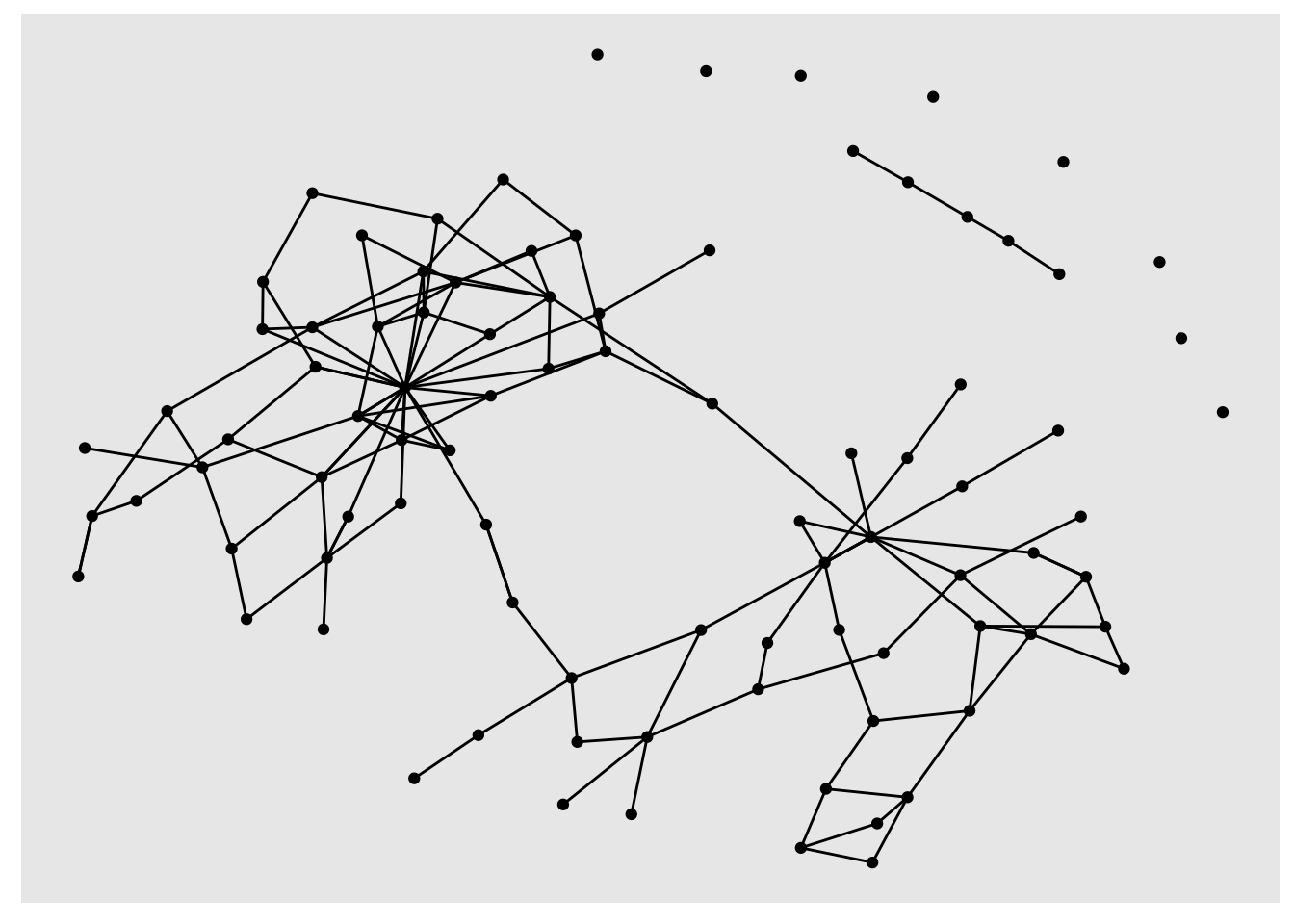
sample_tbl_graph %>%
  activate(nodes) %>%
  mutate(degree = centrality_degree(mode = 'total')) %>%
  filter(degree >2)
## # A tbl_graph: 90 nodes and 136 edges
## #
## # A directed simple graph with 10 components
## #
## # Node Data: 90 x 2 (active)
##   name  degree
##   <chr>  <dbl>
## 1 10580     14
## 2 10612     10
## 3 10938      3
## 4 11172     18
## 5 13045     48
## 6 14200     17
## # … with 84 more rows
## #
## # Edge Data: 136 x 3
##    from    to weight
##   <int> <int>  <int>
## 1     2    80      1
## 2     2    29      2
## 3     3    81      1
## # … with 133 more rows
Visualisation with ggraph
The last step in the workflow is visualising the network. You can use igraph and standard R plotting libraries for this, but I use a package called ggraph, which uses the same language as ggplot (a very well-known visualisation library for R) and adds some special functions to visualise networks. To create a network diagram, first use the function ggraph on your tbl_graph, then add the special ggraph geoms geom_node_point() and geom_edge_link()
library(ggraph)
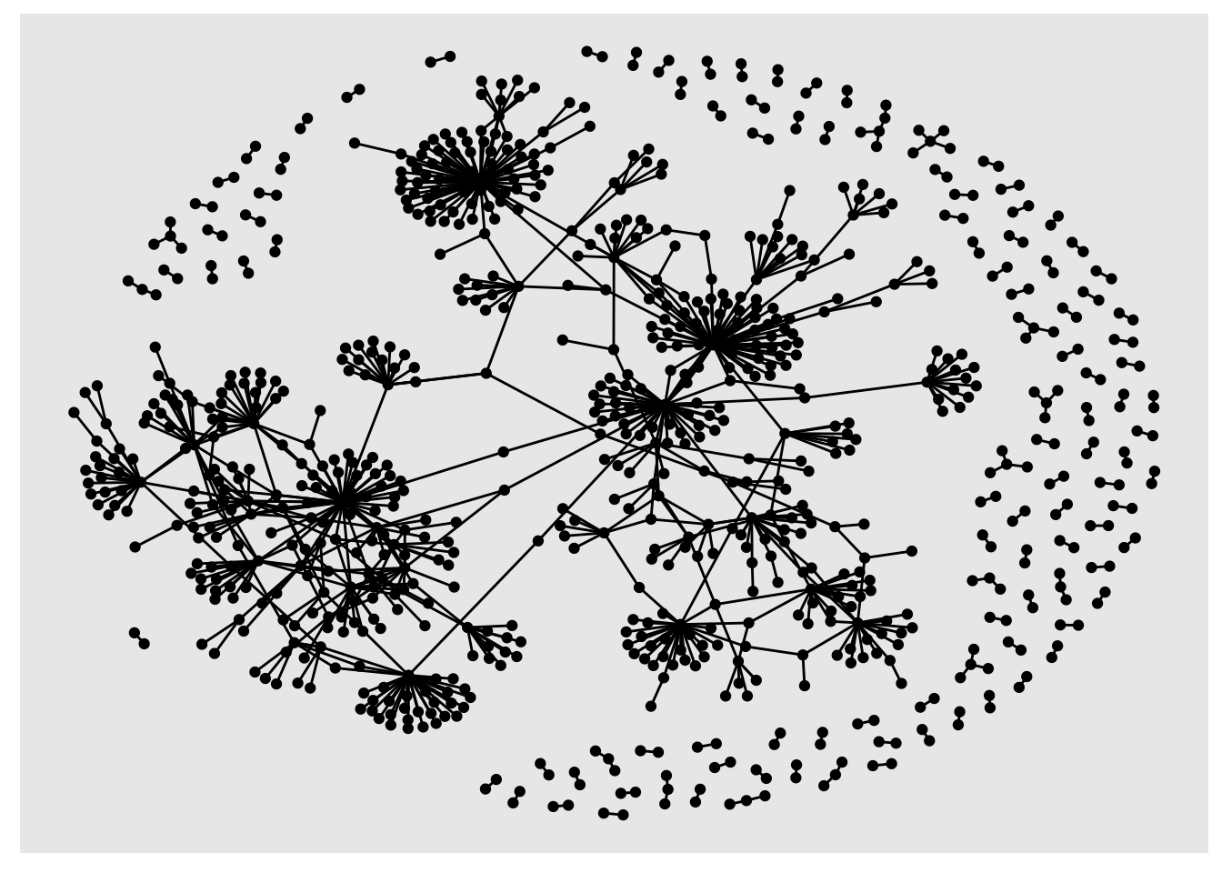
sample_tbl_graph %>% ggraph('nicely') + geom_node_point() + geom_edge_link()
You can use the dplyr pipes to perform calculations, filter the data and then visualise it, all in one go:
sample_tbl_graph %>%
  activate(nodes)%>%
  mutate(degree = centrality_degree(mode = 'total')) %>%
  filter(degree >2) %>%
  ggraph('nicely') +
  geom_node_point() +
  geom_edge_link()
geom_node_point() and geom_edge_link take aesthetics, just like regular ggplot geoms. You can calculate degree scores and then set the size of the nodes to the result:
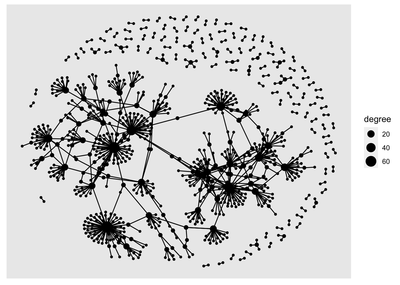
sample_tbl_graph %>%
  activate(nodes)%>%
  mutate(degree = centrality_degree(mode = 'total'))  %>%
  ggraph('nicely') +
  geom_node_point(aes(size = degree)) +
  geom_edge_link()
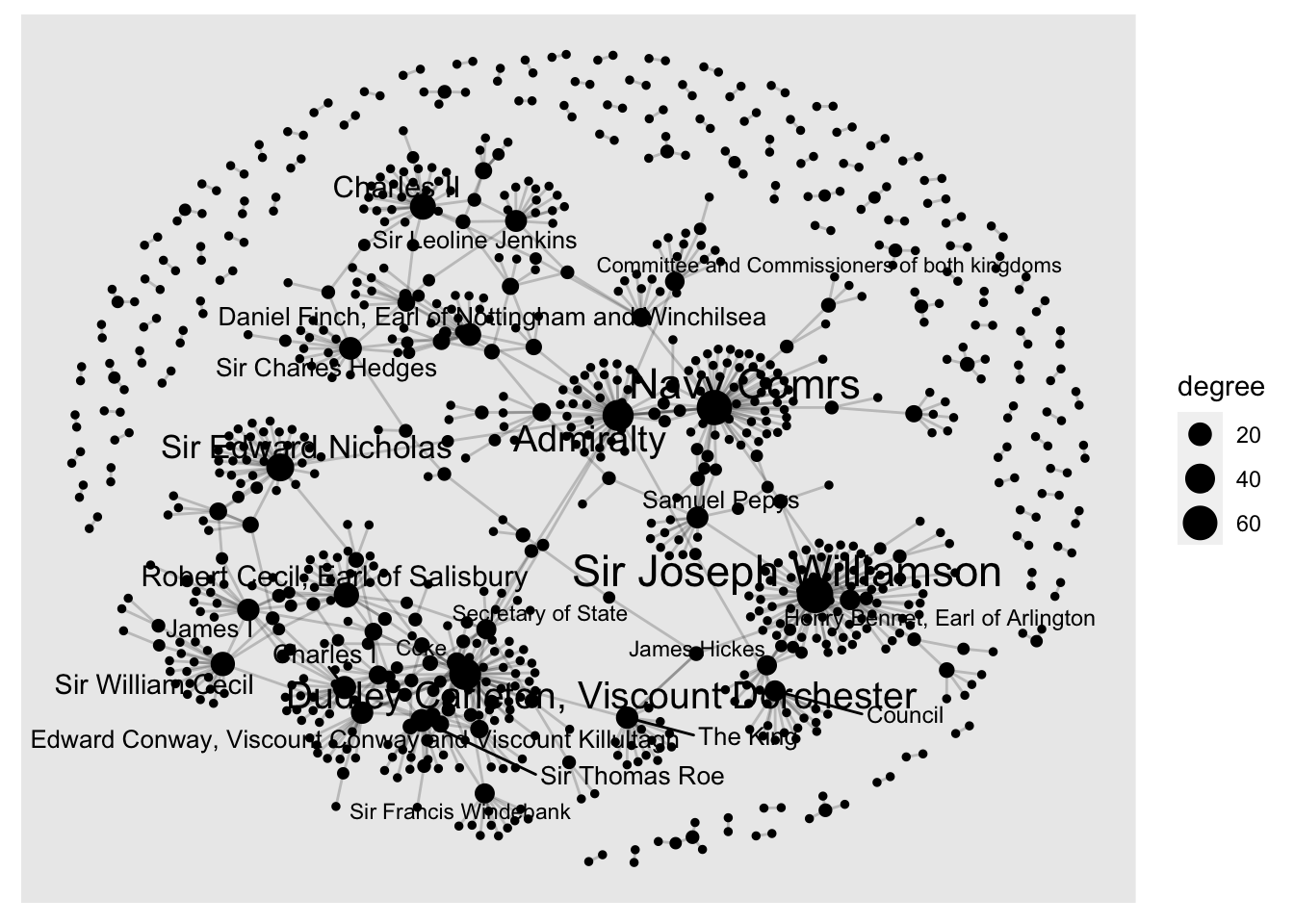
Add geom_node_text() to add text labels to your network. In a larger network, it can be helpful to only show labels belonging to the most-connected nodes. First, join the people table to the nodes table, then use ggraph, setting the label aesthetic. Another dplyr verb, if_else allows you to add conditions to the label command. Here, I’ve used if_else to return the label if the node’s degree score is more than 10:
sample_tbl_graph %>%
  activate(nodes)%>%
  mutate(degree = centrality_degree(mode = 'total'))  %>%
  left_join(people, by = c('name' = 'id')) %>%
  ggraph('nicely') +
  geom_node_point(aes(size = degree)) +
  geom_node_text(aes(label = if_else(degree >10, person_name, NULL), size = degree), repel = TRUE) +
  geom_edge_link(alpha = .2)
## Warning: Removed 851 rows containing missing values (geom_text_repel).
Networks - the Lazy Way!
This workflow works really well for me. The letter data we’re working with has a lot of other attributes, such as time and place information, and being able to do all the network analysis within a single data analysis workflow makes it super easy to run all sorts of complicated and interesting queries.
Learning network analysis can be a big investment in time and effort, and, while the techniques do apply to lots of other areas of data science, it’s not the most transferable coding skill. I called the blog post the lazy person’s network analysis workflow because if you’ve already learned (or intend to learn) the much more general data science and visualisation skills of the tidyverse and ggplot, you’ve already done about 90% of the work. At the same time, any new things you do pick up when using this workflow on network analysis will feed back into your more general coding/data science knowledge.
Yann Ryan
Research Fellow, Networking Archives Project
I’ve been at Queen Mary, University of London since 2014 and recently completed a PhD in the history of early modern news.