This week is about controlling the finer visual details of your charts. This example of a chart made in ggplot2, from the first chapter of this book, is a good example of some of the visual elements you can customise using ggplot2:
Show the code
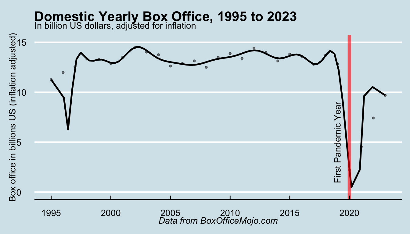
library(tidyverse)library(ggthemes)options(scipen =999999)df = data.table::fread('box_office.csv')df = df %>%mutate(billions =total_inflation_adjusted_box_office/1000000000 )ggplot() +geom_point(data = df, aes(year, as.numeric(billions)), size=1, alpha = .5) +geom_smooth(data = df, aes(year, as.numeric(billions)), method ="lm",formula = y ~poly(x, 23), se =FALSE, color ='black', alpha = .75) +scale_y_continuous(limits =c(0, 15)) +labs(title ='Domestic Yearly Box Office, 1995 to 2023', subtitle ="In billion US dollars, adjusted for inflation", x =NULL, y ="Box office in billions US (inflation adjusted)",caption ="Data from BoxOfficeMojo.com") +geom_vline(xintercept=2020, color ='red', alpha = .6, size =2) +annotate("text", x=2019, y=5, label="First Pandemic Year", angle=90) +theme_economist() +theme(plot.caption =element_text(face ='italic'))
It has a title and a subtitle
The y-axis title has been changed to read something more descriptive
the x-axis title has been remove completely, because it obviously refers to years.
It has an annotation to highlight the first year of the pandemic.
Some elements of the underlying visual parts of the chart have been changed, for example the light blue background, and the white, horizontal gridlines (the vertical gridlines have been removed).
This is all done through the use of several more ggplot layers: primarily labels, annotations, and themes, which we’ll learn about this week.