library(tidyverse)
library(plotly)
p <- df |>
ggplot(aes(x = lifeExp, y = gdpPercap, size = pop, fill = continent)) +
geom_point()
ggplotly(p)43 Making Plots Interactive
Note
The interactive versions will not display in this ‘live’ version of the book. A copy of this page, in the form of a .Rmd document, is available in the Posit Cloud workspace ‘Mapping in-class exercise’. You can follow along by opening that and running each cell in turn with the green arrow at the top-right.
Plotly and ggplotly()
To make interactive plots we can use a library called plotly. Plotly has its own syntax for making plots, but it includes a function which will convert any ggplot plot directly into an interactive plotly plot. To use this, simply load the library and add the plot name to the function ggplotly().
On the interactive plot there are a number of things you can do:
- Hover over a point to get a ‘tooltip’ displaying more information about that data point.
- Zoom in, just draw a rectangle on the plot by clicking and dragging the mouse.
- Toggle any of the categories on or off by clicking the legend points.
- When you hover over any part of the plot you’ll see some display options at the top right.
Any of the themes or scales you use will carry over to the interactive plotly version.
Try it yourself:
The object titanic_df is in your environment. Summarise the data by counting the totals for the sex and embarked columns, and make a bar chart plotting the sex on the x axis, the total on the y axis, and the embarked location as the fill colour of the bars.
Make the chart interactive using ggplotly().
ggplotly() options
ggplotly has some useful options: dynamicTicks = TRUE will change the axis ticks as you zoom in. Setting the tooltip = argument will allow you to specify the text which is displayed when you hover over a shape with the mouse. By default, the tooltip will display all the aesthetics mapped in your visualisation. In the first chart, for example, we have mapped x, y, size, and fill, and these are all displayed as a label when you hover over a point.
Try it yourself:
Copy your bar chart above. Set dynamicTicks = TRUE and set the tooltip to display only the embarked aesthetic.
However to get more usefulness out of the interactive it is helpful to be able to make changes to the tooltips, which can be set to any column or series of columns in your data.. Use this to build informative interactives - for example you could even have a small paragraph of text describing something about each point.
Further more, the tooltips can be formatted with HTML, meaning you can construct nicely formatted hover text boxes with custom information.
This is done using mutate() and a function called paste0(). paste0() will concatenate together text, either from columns in your data or from text within quotation marks. Within paste0(), separate each piece of text you want to concatenate together with a comma.
To use this new column, map it to the text aesthetic, and set it as the tooltip column:
p <- df |>
mutate(country_continent = paste0("<b>Country: </b>", country, "<br>", "<b>Continent: </b>", continent)) |>
ggplot(aes(x = lifeExp, y = gdpPercap, text = country_continent, size = pop, fill = continent)) +
geom_point()
ggplotly(p, dynamicTicks = TRUE, tooltip = 'text')Interactive maps with tmap.
tmap basics
Tmap is also based on the ‘grammar of graphics’, albeit with its own set of vocabulary.
The basic building block is tm_shape() which is the equivalent of ggplot(). Further layers are built on top of this, for example tm_fill() or tm_dots().
Here are the main layers we can add:
tm_fill(): shaded areas for (multi)polygonstm_borders(): border outlines for (multi)polygonstm_polygons(): both, shaded areas and border outlines for (multi)polygonstm_lines(): lines for (multi)linestringstm_symbols(): symbols for (multi)points, (multi)linestrings, and (multi)polygonstm_raster(): colored cells of raster data (there is alsotm_rgb()for rasters with three layers)tm_text(): text information for (multi)points, (multi)linestrings, and (multi)polygons
If we pass an sf object to tm_shape() and then add an appropriate layer, we will get a basic map. To map further data to this map, we can map data columns to aesthetics, again, similarly to that we added using ggplot. Here is the most common aesthetics:
fill: fill color of a polygoncol: color of a polygon border, line, point, or rasterlwd: line widthlty: line typesize: size of a symbolshape: shape of a symbol
Set these aesthetics within the relevant shape, e.g. tm_polygon(fill = 'income_grp')
To make an interactive map using the worldmap, do the following:
Load the tmap library.
Download a map from R Natural Earth
Switch to the ‘view’ mode using
tmap_mode("view")to make the output an interactive map.tm_shape()is more or less the equivalent ofggplot(): it’s the ‘base’ of the map, where we specify which shapefile should be used. On top of this we add layers, such as polygons or points, and also additional map elements such as a legend, scale, projection, and so forth. We can also add additionaltm_shape()layers.Add the
tm_polygons()layer which will draw polygon shapes on the map based on the shapefile. Set thecolto theincome_grpcolumn. Note the difference from ggplot - where we would set thefill, and the column name would not be in quotation marks. Set theidwhich will determine which column is used to display text with a mouse hover.Add a
tm_view()layer, which allows us to set options for the interactive viewer. Add a vector of three numbers: the starting latitude and longitude, and the zoom level.
library(tmap)
library(tidyverse)
library(rnaturalearth)
library(sf)
sf_use_s2(FALSE)
worldmap = ne_countries(scale = 'medium', returnclass = 'sf')
tmap_mode("view")
tm_shape(worldmap) +
tm_polygons(fill="income_grp", id = 'name' ) +
tm_view(set.view = c(0, 50, 3))Tmap can do cool things like interactive facets, using the layer tm_facets():
tmap_mode("view")ℹ tmap mode set to "view".tm_shape(worldmap) +
tm_polygons(c("income_grp", 'pop_est'), id = 'name') +
tm_view(set.view = c(0, 50, 4)) +
tm_facets(sync = TRUE, ncol = 2)In class exercise:
The following is a good example of the kind of real-world workflow in making a map from external data, including the kinds of problems with matching and cleaning you’ll often encounter.
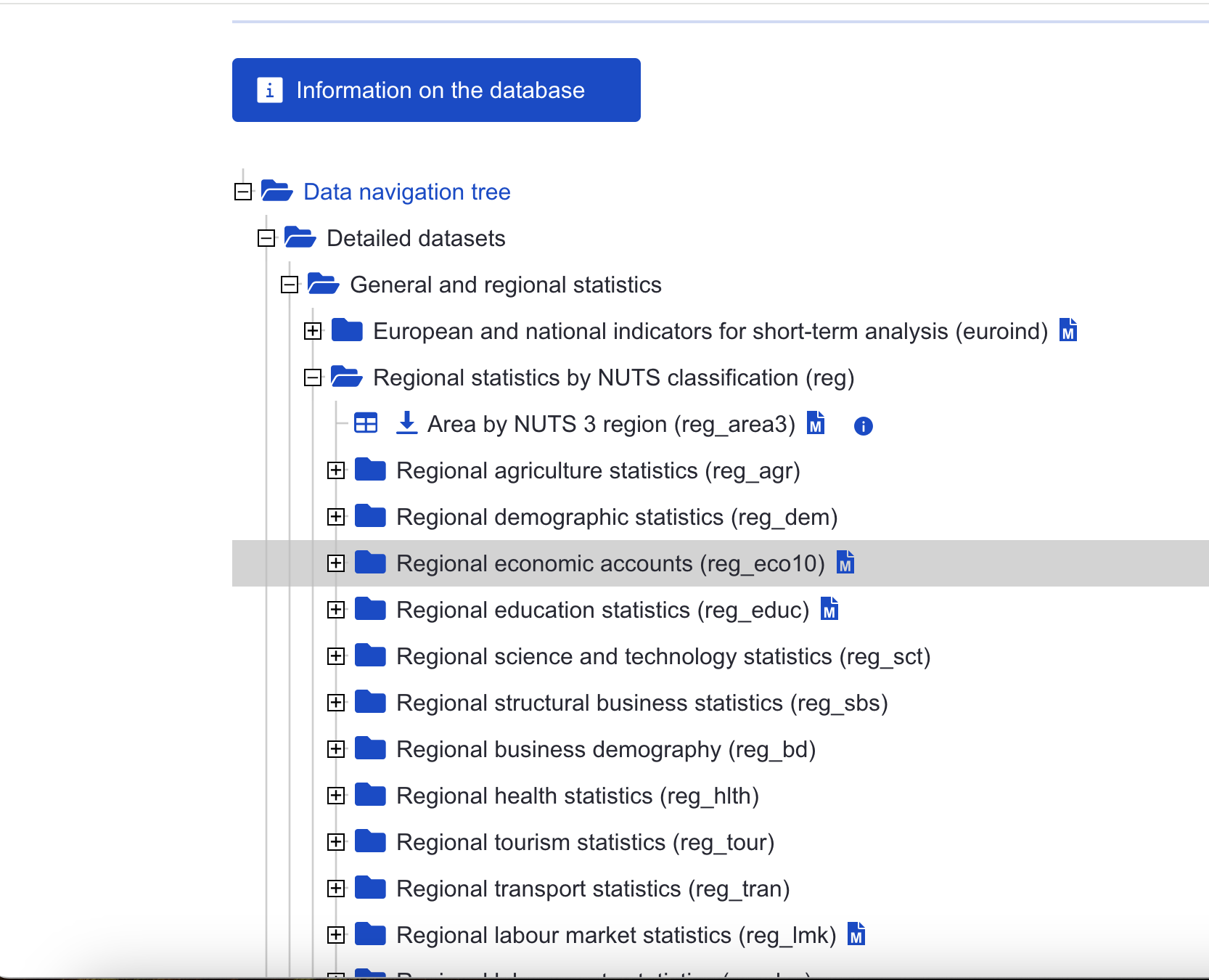
Using the eurosat database, choose a dataset to visualise. You want to choose something from Detailed datasets -> General and Regional Statistics -> Regional statistics by NUTS classification (reg), as in the screenshot here:
Download a shapefile of the NUTS regions from the official EU site. Choose the least-detailed scale so you don’t run into computer memory problems. Select the ESPG: 4326 CRS.
Upload these files to Posit cloud (or keep on your local machine if you’re running R there).
Make a map. Start by selecting a single year and shading each region by the colour of your dataset.
See how far you can get with the following:
Use a fill colour palette which more easily distinguishes the lower and higher values.
Use theming to remove unwanted elements of the map.
Adjust the coordinate limits to focus on the main region of Europe, ignoring the Atlantic islands.
The map looks a little strange with missing regions and countries (i.e the UK). How could we solve this, so they are at least present, but perhaps grayed out?
Try this extra challenge: make a version which creates a series of mini-maps, one for each year in the data. To do this you’ll need to
pivotyour data so that it is in a ‘long’ format, with each data point for each year in a single row, and use a function calledfacet_wrap().